Updated
How we designed Palytt
Palytt's look is called Pal's Table: cream surfaces, coffee-ink outlines, a round match sticker, and one line from Pal instead of a chatbot. This is the story behind it: what we chose, what we cut, and why each rule exists, told for anyone curious how a food app earns trust at a glance.
Nine decisions, a tour of every main screen, and the full system behind them: color, dark mode, type, shape, components, icons, motion and voice.
Outlines, not shadows. One hero per screen.
The brief: a decision, not a feed
Palytt exists to answer two questions: what should I order, and where should we eat. So the design had one job. Every screen should get you closer to a decision in a glance, then get out of the way of the food.
Before drawing anything we looked at what food apps already own. Red belongs to reviews, reservations and guidebooks. Stars, numbered leaderboards and score bubbles belong to ranking apps. Scrapbook collage belongs to social ordering apps. And almost every AI assistant shows up as a chat bubble.
We wanted something that felt like sitting down at a friend's table: warm, a little playful, and honest about why it's suggesting what it suggests. We called it Pal's Table.
Decision 1
Outlines, not shadows
Every surface in Palytt is flat, with a 2pt outline in coffee ink. No soft drop shadows, no frosted glass, no gradient washes. The only gradient in the whole app is the scrim that keeps text readable over a photo.
Outlines read like ink on a menu or a sticker on a lunchbox, which is the feeling we wanted. They also hold up where food apps get used: in bright sun, over busy photos, at a glance while someone's waiting for you to order. And one rule replaces a whole ladder of elevation levels, so iOS, the web and Android can draw the same card the same way.
Tonkotsu ramen
Ramen shop · 0.4 mi
Rich broth, soft egg — your two favorites.
- Blurred shadows
- Glass
- Gradient washes
In the app · Friends’ feed
Decision 2
The shadow is earned
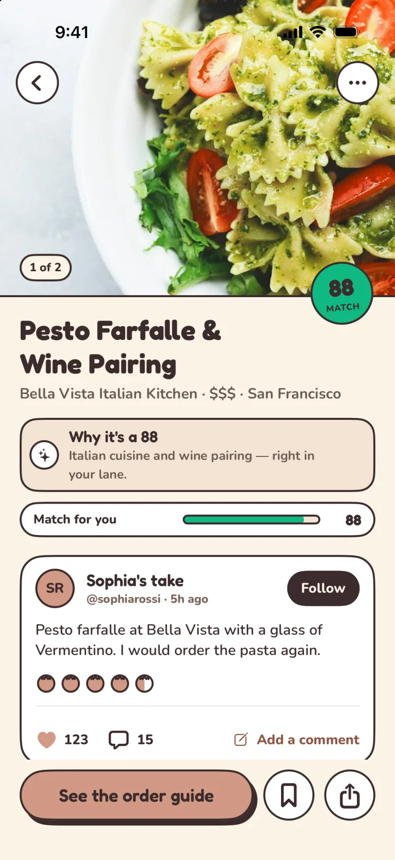
Shadows aren't banned, they're rationed. Each screen gets exactly one raised element: the hero card or the main action, with a hard offset "sticker" shadow (4 across, 5 down, no blur).
When everything floats, nothing does. Giving the shadow to one thing tells you where to start without a single word. When you press a raised button it slides down onto its shadow, like pressing a sticker flat, instead of shrinking.
In the app · Dish
Decision 3
A match score, not a rating
Stars tell you what strangers thought on average. We wanted to tell you something more useful: how well a dish fits you. So every dish carries a 0–100 match score on a round, slightly tilted sticker we call the Bao badge, after the bun it's shaped like.
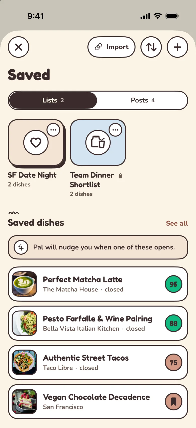
There are no stars and no numbered leaderboards anywhere in Palytt. A 71 isn't a dish losing a contest, it's a dish that's a decent fit for your taste. And the score has to be earned: it only appears when it's built from your own signals, and when it isn't, the order guide says it's showing popularity instead. Read more on how taste matching works.
- 92MATCH80 and upA strong fit
- 71MATCH60 to 79Worth a look
- 48MATCH40 to 59Maybe
- 23MATCHUnder 40Probably not you
In the app · Saved
Decision 4
The AI speaks in notes, not chat
Palytt uses AI to rank dishes and explain its picks, but you'll never find a chat window. You shouldn't have to hold a conversation to get dinner. Instead, the AI speaks through Pal's notes: a small sparkles sticker and one short line, always on the same milk-tea tint.
One line is a hard limit on purpose. It forces every recommendation to come with a reason you can check against your own taste, and it keeps the food, not the explanation, as the biggest thing on the screen. "Pal" is simply the name of that voice.
Rich broth, soft egg — your two favorites.
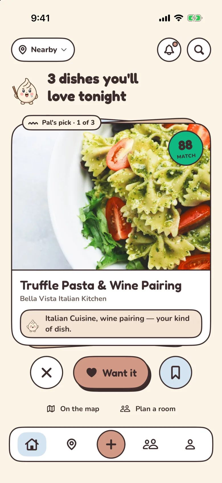
Italian cuisine and wine pairing — your kind of dish.
Matches your earthy, lightly sweet drink saves.
Couldn't load picks. Pull to try again.
In the app · Dish
Decision 5
We retired our mascot
Our first designs had a dumpling character named Pal on almost every screen. In September 2026 we retired it. A face competes with the food for your attention, and the food should win.
What was worth keeping was the mood. Loading, empty, error and celebration moments now show a single mood icon sticker: a bold icon in an outlined, tinted circle. It's quieter, it works at any size, and it still tells you how the app feels about what just happened.
The one place characters remain is taste types: each of the 16 types has its own animal, and they only ever appear with taste type content.
- ThinkingLoading, Pal working
- HungryBrowsing picks, empty saves
- HappyLikes, new friends
- CelebratingPosted, room result
- SadErrors
- IdleNeutral states
In the app · Picks
Decision 6
One motif: the dumpling pleat
Pal's Table has exactly one decorative motif: the dumpling pleat, three short curved strokes. It marks section titles and the "Pal's pick" tab, and nothing else gets ornament. One mark used consistently is easier to recognize than ten used occasionally.
The same restraint applies to icons. There's no emoji anywhere in the interface, just one icon set drawn with the same heavy, rounded stroke. Where most apps would reach for a thumbs-up, Palytt uses a bowl with a heart, because approval here is always about food.
The bowl with a heart: Palytt's approval glyph, in place of a thumbs-up.
In the app · Order guide
Decision 7
Type and color from the table
The palette comes from the table: a cream ground, white plates, milk tea, old rose and coffee. The only cool colors are two soft blues, and they're reserved for the social side of the app, rooms and friends, so you can tell at a glance when you're deciding with other people.
The primary button is old rose with coffee text, not white, because white on rose is hard to read. For the same reason links use a deeper rose: the brand rose only reaches about 3.2:1 contrast on cream, too low for small text.
Type is two rounded, friendly faces. Fredoka handles titles, buttons and every match score, so numbers always look like part of the brand. Nunito handles everything you read. Both scale with your text size setting, and everything is in sentence case. The full palette and dark mode and the type scale are further down.
Display · Fredoka
Know what to order
Body · Nunito
Your friends already found the best dishes. Pal tells you which ones you'll love.
- Ground #fbf4e6Every screen starts on cream
- Card #ffffffDishes, places, lists
- Note #f3e3d3Only Pal's notes
- Old Rose #d29985The primary action
- Sky #d4e4f2Rooms, friends, the current tab
- Coffee #3b2b2bText, outlines, the one shadow
In the app · Rooms
Decision 8
Picks first, then everything else
Open Palytt and the first thing you see is a pick, not a feed. Home leads with Pal's pick, the best match near you, then a short "also" list, and only then what people are ordering. The headline follows the clock, so the same screen reads "for lunch" at noon and "tonight" at seven.
The pick is a single flat card, never a tilted stack, so it never reads as something to swipe past. Underneath, a floating tab bar carries five icons with no labels: Picks, Map, a rose button to post a dish, Rooms, and You. The current tab gets a sky pill that glides as you move, and each tab keeps its place when you come back.
Pal's pick
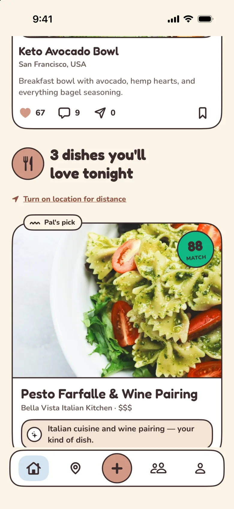
3 dishes you'll love tonight
Italian cuisine and wine pairing — your kind of dish.
In the app · Picks
Decision 9
One system on every platform
Pal's Table isn't a style guide that lives in a drawer. Its canonical tokens define the colors, sizes and radii that the iPhone app, this website and our Android build implement. Approved design boards give screens a visual target; we compare shipped screenshots with those boards and adjust until they match.
The rules include the unglamorous parts: 44-point touch targets, text that grows with your size setting, a dark mode where the ink turns cream and the ground turns coffee, and motion that stands still when you ask for reduced motion. This page is built from the same pieces, which is why the badges, notes and pleats above look exactly like the app.
- Picks
- Order guide
- Rooms
The details
A tour of the app, screen by screen
Thirteen screens, captured straight from the iPhone app. Under each one, the parts of the system you can spot on it.
Discover
Cream grounds. Everything here is about one question: what should I order?
Picks
The home tab leads with a decision, not a feed.
- The headline follows the meal: “3 dishes you’ll love tonight”, with the hungry mood icon beside it.
- Location is asked once, as a quiet link, not a pop-up.
- One flat Pal’s pick card, marked with the pleat tab, an 88 Bao badge and a one-line Pal’s note.
- The floating tab bar: five icons, a sky pill on the current tab, a rose button to post.
Friends’ feed
What people are ordering, under the picks.
- A pleat above “From your friends” marks the section.
- Each post is a white outlined card: initials avatar, photo, dish name in Fredoka and a 95 badge.
- Social surfaces switch to sky, like the “Friends’ favorites, nearby” card.
- Round outlined icon buttons for notifications and search.
Dish
A single dish, and why it fits you.
- The photo runs to the edge; the Bao badge sits on its bottom edge like a sticker.
- “Why it’s a 88” is a Pal’s note, followed by a match bar in the same tier color.
- A friend’s take is its own outlined card, with a dark Follow button.
- The one raised element is “See the order guide”; save and share are flat icon buttons.
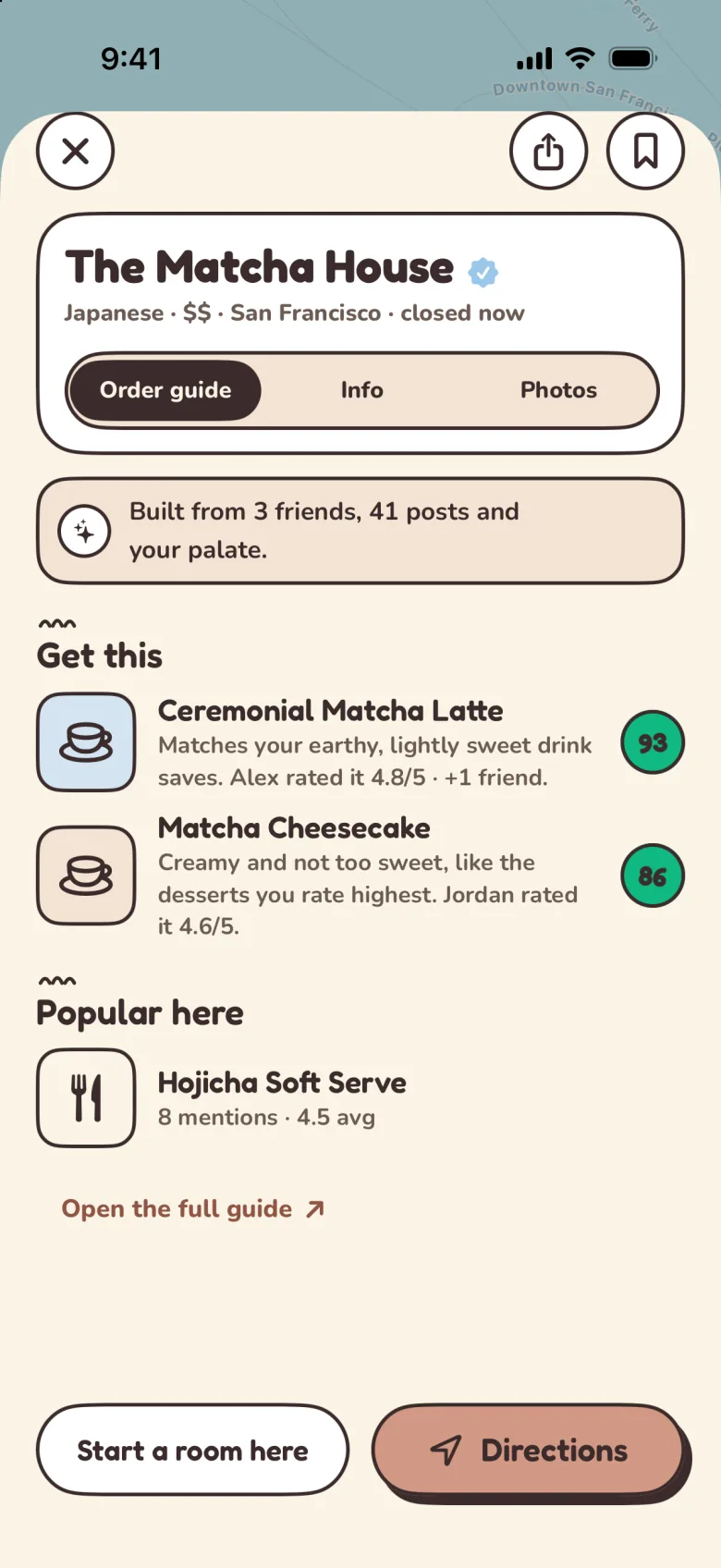
Order guide
Every restaurant’s menu, ranked for you.
- A segmented control (Order guide, Info, Photos): coffee pill on an outlined capsule track.
- A Pal’s note shows its work: “Built from 3 friends, 41 posts and your palate.”
- “Get this” and “Popular here” are separate, pleat-marked lists, so taste and popularity never blur.
- Each dish carries its badge and a reason in a line or two, like “Alex rated it 4.8/5”.
Map
A muted map, so the match scores do the talking.
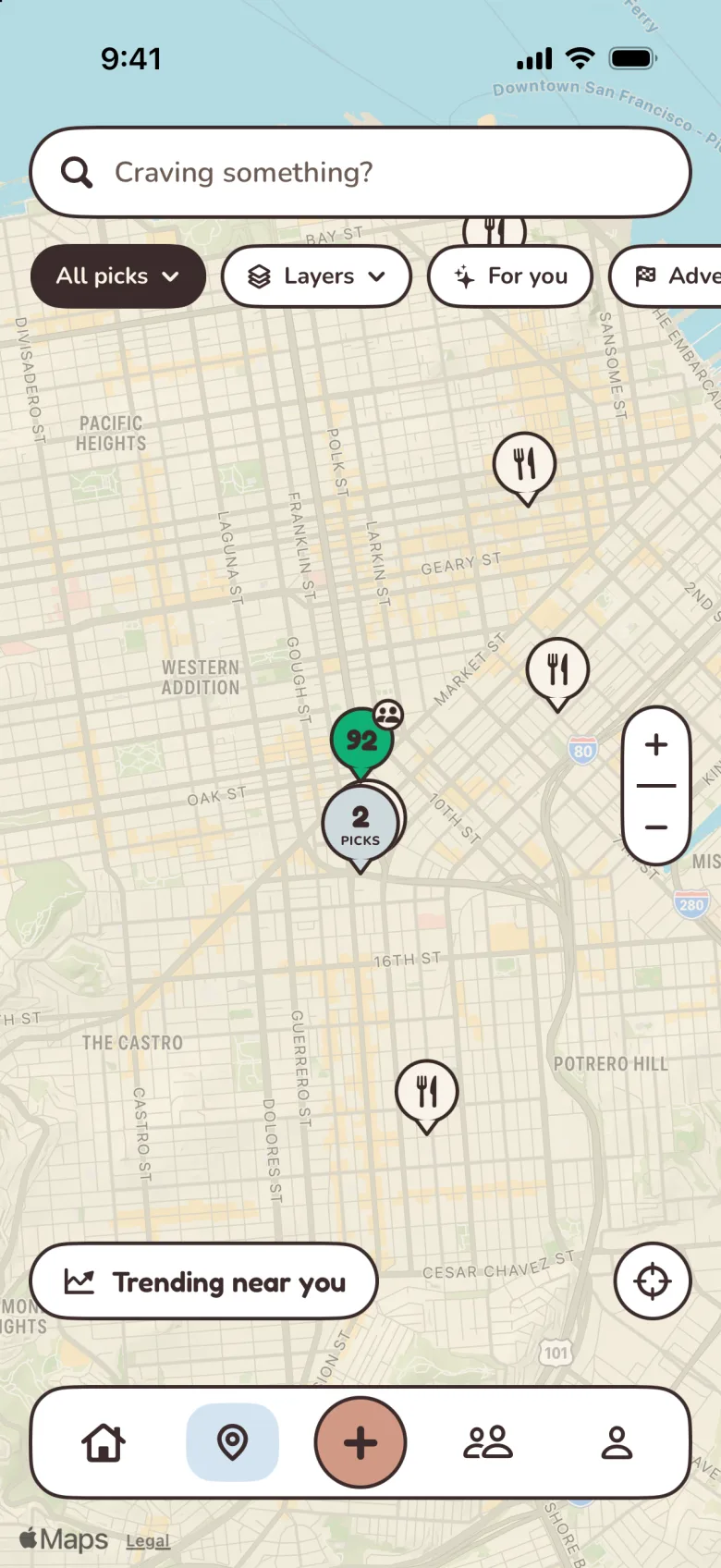
Food map
Your picks, friends’ finds and trending spots.
- The search field is a capsule that asks “Craving something?”
- Filter chips scroll in a row; the selected one fills with coffee.
- Pins are small Bao badges, so you can read the fit before you tap.
- The map itself is muted, so pins and chips carry the color.
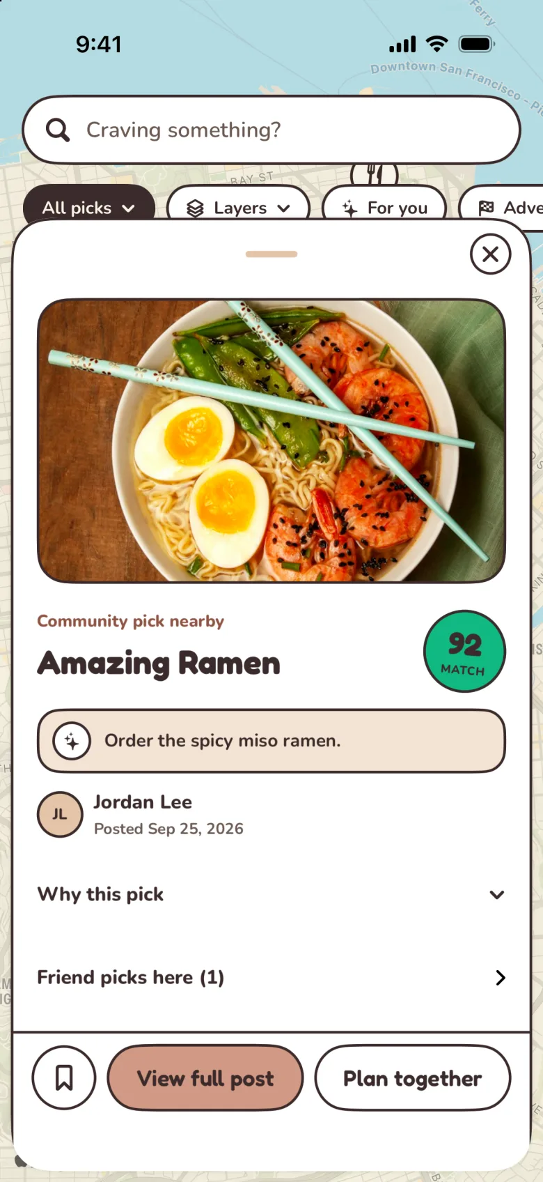
Map pick
Tap a pin, get the dish to order.
- A sheet with its own close button, spaced from the top edge.
- A small eyebrow, “Community pick nearby”, sits over the Fredoka title and a 92 badge.
- The Pal’s note is the order itself: “Order the spicy miso ramen.”
- “View full post” is raised; “Plan together” stays flat beside it.
Together
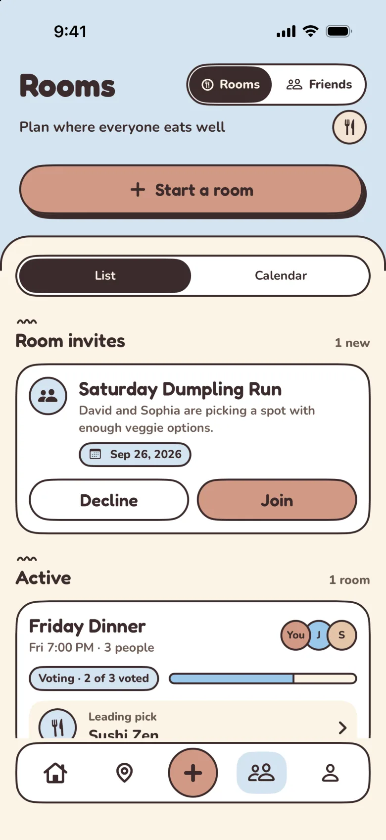
Rooms and friends live on sky, so you always know when you’re deciding with people.
Rooms
Agree on dinner before the group chat spirals.
- A sky header ground with a cream sheet below it.
- “Start a room” is the screen’s one raised button.
- Invites are cards with a flat Decline and a rose Join.
- Active rooms show an avatar stack, a “2 of 3 voted” progress bar and the leading pick.
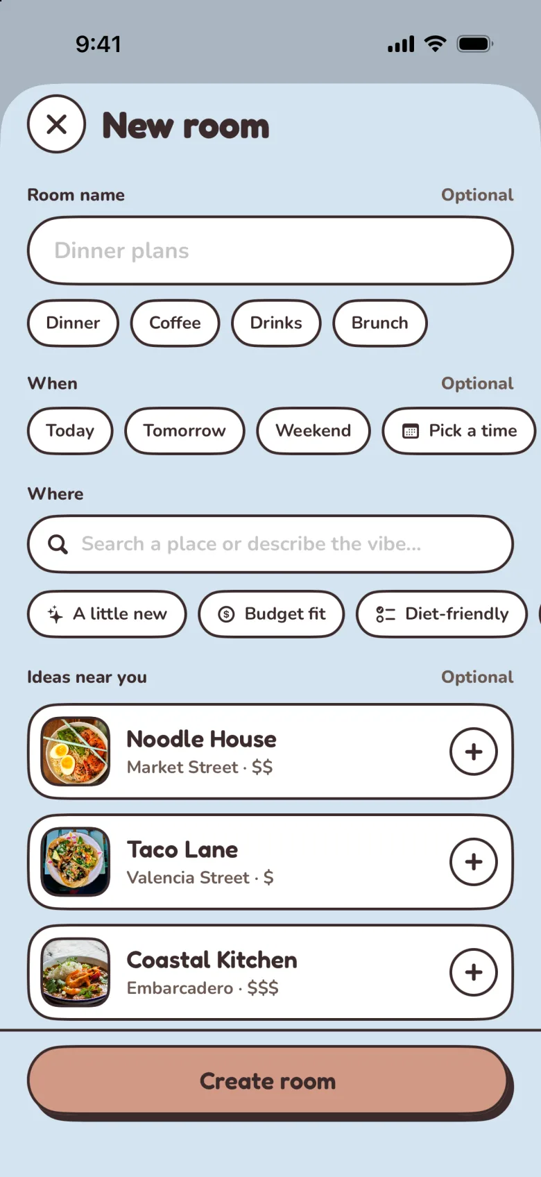
New room
Set up a plan in a few taps.
- Every choice is a chip: meal (Dinner, Coffee, Drinks, Brunch), day, and vibe.
- Inputs are outlined capsules, each marked optional where it is.
- Ideas near you are rows with a round add button.
- “Create room” is pinned at the bottom as the raised action.
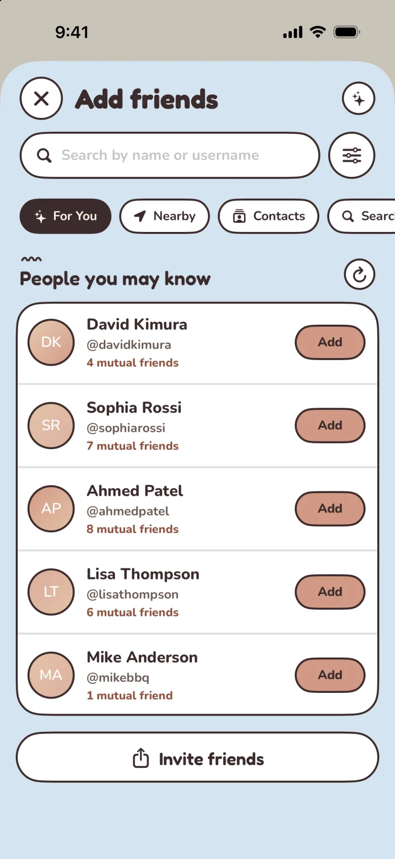
Add friends
Friends make the scores better.
- Initials avatars rotate through rose, blue, milk tea and white fills.
- Each row shows mutual friends and a rose Add button.
- For you, Nearby and Contacts are chips, not tabs.
- Invite friends is a full-width secondary button.
You
Your taste, your saves and what you’d order again.
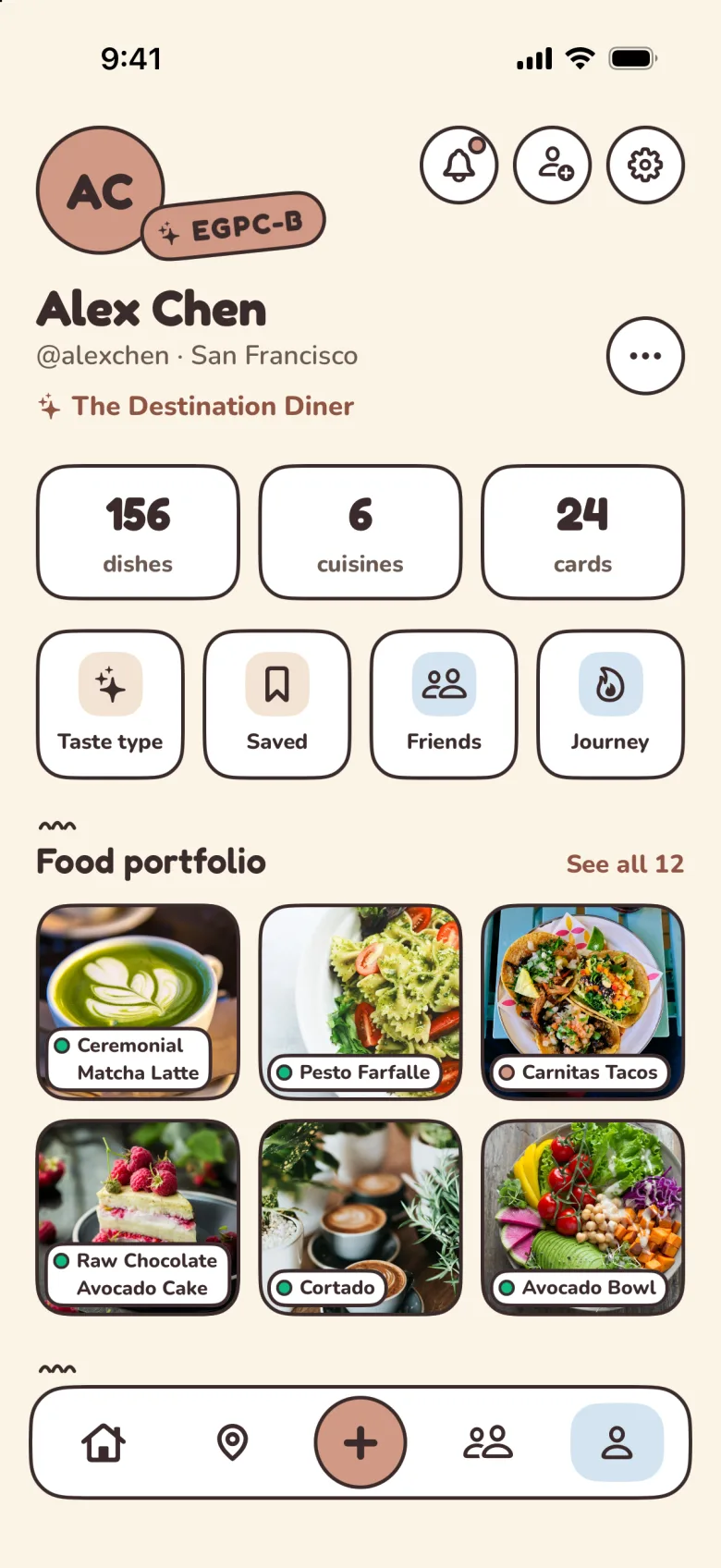
Profile
A food portfolio, not a follower count.
- The taste type rides on the avatar as a tilted sticker.
- Stats (dishes, cuisines, cards) are big Fredoka numbers in outlined tiles.
- Shortcuts are square outlined tiles with one icon each.
- The portfolio labels each photo with the dish, as a small sticker.
Saved
Save dishes, not just places.
- Lists and Posts switch with the segmented control.
- Lists are square tiles with an icon sticker and a count.
- A Pal’s note promises something useful: “Pal will nudge you when one of these opens.”
- Saved dishes keep their Bao badges, so the list is sorted at a glance.
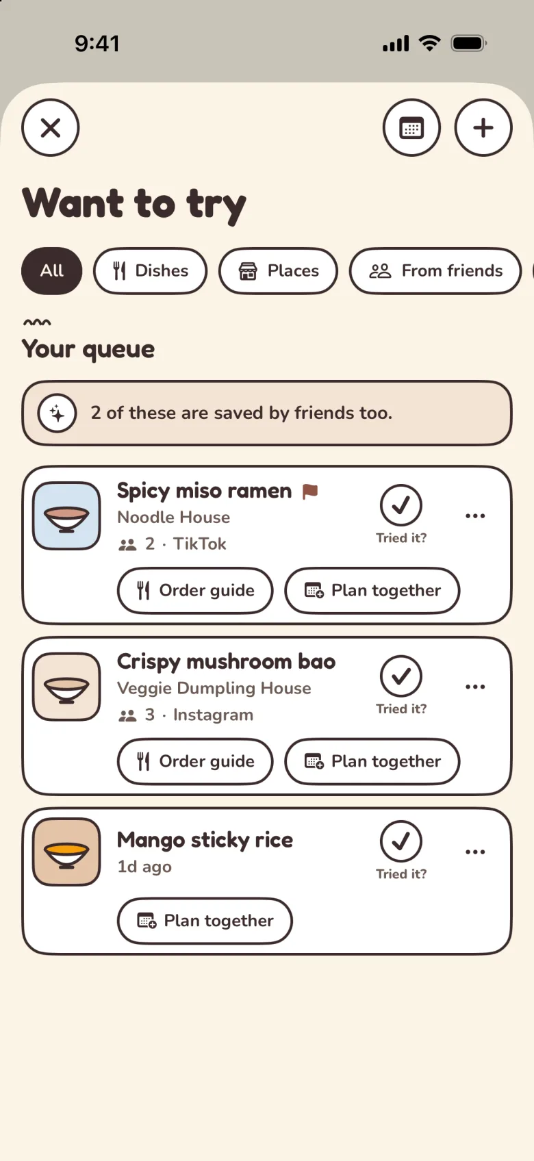
Want to try
A queue of dishes you mean to get to.
- Filter chips: All, Dishes, Places, From friends.
- Each dish gets a small icon tile and where you found it, like TikTok or Instagram.
- A “Tried it?” check on every card closes the loop.
- Two small actions per card: Order guide and Plan together.
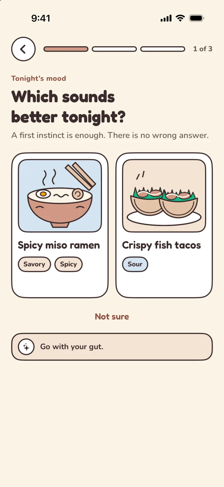
Taste sprint
Three quick questions to tune your picks.
- A three-segment progress bar instead of a step counter.
- Choices are big cards with flat dish stickers, not photos, so no answer looks “better”.
- Flavor tags (Savory, Spicy, Sour) are small outlined pills.
- Pal’s note lowers the stakes: “Go with your gut.”
The details
Color and theme
Every color has one job. Old rose means “do this”, sky means “with other people”, the note tint means “Pal is talking”, and the tier colors mean “how well this fits you”. Nothing is decorative, so a color always tells you something.
Text on any tinted fill is coffee, never white. And there are no gray scales: secondary text and dividers are warm browns, so nothing on screen goes cold.
Brand
- Old Rose #d29985Primary action fill, 60–79 match
- Old Rose, pressed #b86f5bA primary button while pressed
- Milk Tea #e3c4a8Stickers, secondary fills
- Coffee #3b2b2bInk: text, outlines, the one shadow
- Blue accent #9ac8ebInfo, you-are-here, friend avatars
- Sky #d4e4f2Rooms and friends, the tab pill
Surfaces
- Ground #fbf4e6Behind every screen
- Card #ffffffDishes, places, lists, sheets
- Note #f3e3d3Only Pal’s notes
- Camera #2b211fCamera and menu lens chrome
- Map block #e9dcc3The muted map under the pins
Text
- Primary #3b2b2bTitles and body
- Secondary #6b5a52Places, captions, meta
- Tertiary #7a5f55Timestamps, 12pt and up only
- Rose link #8f5443Links and small emphasis
Match tiers
- 93MATCHGreat · 80–100#10B981
- 72MATCHGood · 60–79#d29985
- 51MATCHFair · 40–59#F59E0B
- 28MATCHLow · 0–39#e6e0d8
Dark mode
Dark mode keeps the same rules with the lights down. The ground turns a warm coffee instead of black, the outlines and the one hard shadow turn cream, and links move to a lighter rose so they still pass contrast.
- Ground #241c1aWarm coffee, never black
- Card #2e2422One step lighter than the ground
- Ink #f5ede6Outlines and the shadow turn cream
- Note #3a2d29Pal’s notes
- Sky #2c3640Rooms and friends
- Rose link #e3b3a2Links on dark grounds
Tonkotsu ramen
Ramen shop · 0.4 mi
The details
Typography
Two rounded faces, both open source. Fredoka is for anything you glance at: titles, buttons and every number, including match scores, so a 92 always looks like Palytt. Nunito is for anything you read. Its rounded ends match Fredoka’s, but it stays calm at small sizes.
Both are bundled in the app and scale with your text size setting. Weights stay heavy (600 and up) so text holds its own next to 2pt outlines. A component never uses more than two weights, all caps is only for tiny eyebrow labels, and everything else is sentence case.
Display · Fredoka 500, 600, 700
Aa 92
Know what to order, everywhere
Body · Nunito 500, 600, 700, 800
Aa 92
Your friends already found the best dishes. Pal tells you which ones you’ll love.
Hero
Fredoka 34 · Bold · Onboarding, celebrations
Your taste, made useful
Screen title
Fredoka 30 · Bold · Top of a screen
Want to try
Card title
Fredoka 21 · SemiBold · Dish and place names
Pesto farfalle & wine pairing
Section title
Fredoka 20 · SemiBold · Under the pleat
Popular here
Button
Fredoka 18 · SemiBold · Every button
See the order guide
Body
Nunito 15 · SemiBold · Main text
Matcha latte and cheesecake at The Matcha House.
Body strong
Nunito 15 · Bold · Emphasis
Built from 3 friends, 41 posts and your palate.
Pal’s note
Nunito 14 · Bold · The AI’s one line
Rich broth, soft egg — your two favorites.
Meta and chips
Nunito 13 · Bold · Place, distance, filters
Bella Vista Italian Kitchen · $$ · San Francisco
Eyebrow
Nunito 12 · ExtraBold · Tiny labels only
Community pick nearby
The details
Shape, outline and spacing
One 2pt coffee outline on everything, generous rounded corners, and an 8-point grid. Corners get rounder as things get bigger and more important, and anything you tap is a capsule or a circle, so buttons never look like cards.
Corner radius (pt)
- 30Hero card, sheet
- 24Card
- 22Tab bar
- 18Tile, note
- CapsuleButton, chip, input
- CircleBadge, avatar
Outline and elevation
- Outline: 2pt coffee on every card, chip, button, input, avatar and badge. Cream in dark mode.
- Sticker shadow: 4 across, 5 down, no blur, on one element per screen. A smaller 3×4 version for floating pins and chips when a screen has no hero.
- Soft shadows, glass and blur: not used, for content or chrome.
Spacing (8-point grid)
- xs4
- sm8
- md12
- lg16
- xl20
- xxl24
- xxxl32
Sizes (pt)
44
Touch target
52
Button
36
Chip
64
Tab bar
64 · 44 · 36
Bao badge
16–20
Screen padding
The details
Components
The same design rules shape controls on every platform. These specimens use the web components and styles from this site, alongside the corresponding controls in the iPhone and Android apps.
Buttons
Primary · secondary · dark · ghost
Sizes: 52 · 44 · 36
Old rose fill with coffee text is the default action. The raised hero version is the same button with the sticker shadow. Destructive actions get their own red. Supported app actions add haptic feedback where it helps confirm a choice.
Icon buttons
Secondary · primary · dark · sky
44pt circles with a 2pt outline. Sheets and full-screen views float theirs 16pt below the top edge, never flush.
Chips, tabs and toggles
Filter chips
Segmented control
Switch
Fields, titles and people
Search field
Section title
Avatars and badges
The details
Icons
One icon set per platform, drawn heavy and round to sit next to Fredoka: SF Symbols on iPhone, lucide on the web, with a 2.2 stroke and round caps. Icons come in five fixed sizes and scale with your text size in the app. There are no emoji and no thumbs; approval is a bowl with a heart.
Sizes
- xs12
- sm16
- md20
- lg24
- xl32
Shared vocabulary
- Pickshouse
- Mapmappin.and.ellipse
- Postplus
- Roomsperson.2
- Youperson
- Searchmagnifyingglass
- Savebookmark
- Sharesquare.and.arrow.up
- Likeheart
- Filtersslider.horizontal.3
- Settingsgearshape
- Approvepal.bowl.heart
The details
Motion and feel
Motion in Palytt is springy but brief: it should feel like handling paper stickers on a table, not watching an animation. The controls use a small set of spring timings, and selected actions add haptic feedback.
Springs
| Spring | Response | Damping | Used for |
|---|---|---|---|
| Quick | 0.3s | 0.7 | Button presses, toggles |
| Medium | 0.4s | 0.6 | Sheets sliding up |
| Smooth | 0.5s | 0.75 | Page transitions, mood changes |
| Interactive | 0.6s | 0.8 | Drags, pull to refresh |
Press, don’t shrink
A raised button slides down onto its shadow when you press it, like pressing a sticker flat.
Feel it
Light haptics for toggles, medium for taps and confirmations, heavy only for destructive actions.
Pull to refresh
The hungry mood icon sits in a coffee ring that closes as you pull, then turns while the feed reloads.
Cards zoom open
A dish card grows into its screen, so you never lose your place.
The tab pill glides
The sky pill slides between tabs, and each tab keeps its scroll position.
Reduced motion
With reduced motion on, the ring stays closed and stickers hold still.
The details
Voice
The words are part of the design. Palytt talks like a friend who knows food: short, specific and never salesy. UI text is sentence case, two sentences at most, and speaks to “you”. There are no emoji, and error messages never shout.
Friendly
Say“Found a spot you might love”
Not“Based on your preferences, we recommend…”
Concise
Say“What are you craving?”
Not“Tell us about what kind of food you’re interested in today”
Honest
Say“Honest picks from friends”
Not“The BEST restaurants curated for YOU!”
Calm about errors
Say“Something went wrong. Tap to retry.”
Not“Oops!! Something broke!”
Good to know
Why doesn't Palytt use star ratings?
Stars average what strangers thought. Palytt shows a 0–100 match score for your taste on a round badge, so each dish is scored for you instead of ranked against everything else. Learn more about how taste matching works.
Is Pal a chatbot?
No. Pal is the name of the voice behind Palytt's recommendations. Each one is a short note with a reason you can check, not a conversation you have to steer.
What happened to the dumpling mascot?
We retired it in September 2026. Loading, empty, error and celebration moments now use a simple mood icon, and Pal lives on as the voice of the notes.
What fonts does Palytt use?
Fredoka for titles, buttons and match scores, and Nunito for body text. Both are open-source fonts under the SIL Open Font License.
Does Palytt have a dark mode?
Yes. In dark mode the cream ground turns a warm coffee and the ink outlines turn cream, so the same rules hold in both.
Related reading
- How taste-based food recommendations actually workLearn how taste profiles, friend signals, and saved dishes help Palytt point you toward meals you are more likely to love.
- What's your taste type? The 16 food personality types, explainedFour letters for how you eat and one for how bold you like it. Meet the 16 food personality types, their four families and the character behind each one.
- Restaurant apps compared for 2026: tracking, reviews, and knowing what to orderGoogle Maps, Yelp, Beli, Truffle, Mapstr, Savor, Morel, Palytt, Skip Menu, MenuFit and Menu Order AI: which restaurant app fits which job.